


The design world doesn’t stop to check if you’re ready. Every time you blink, someone’s rethinking navigation, breaking grid rules, or reimagining what a contact page should feel like. That’s not a bad thing—it means business websites are finally catching up to what people want. Less noise, more intent. In 2026, the best business sites won’t just look good. They’ll feel good to use. Clean, thoughtful, grounded. No gimmicks, no digital somersaults, just design that knows when to talk and when to get out of the way.
If you’re a company gearing up for a website refresh or hunting for a design firm that gets it, the shifts coming next year are worth knowing now. The visual trends are moving fast, but the deeper changes—the ones that stick—are rooted in what we’ve all been craving online for years: clarity, ease, and a little bit of personality that doesn’t scream “startup pitch deck.”
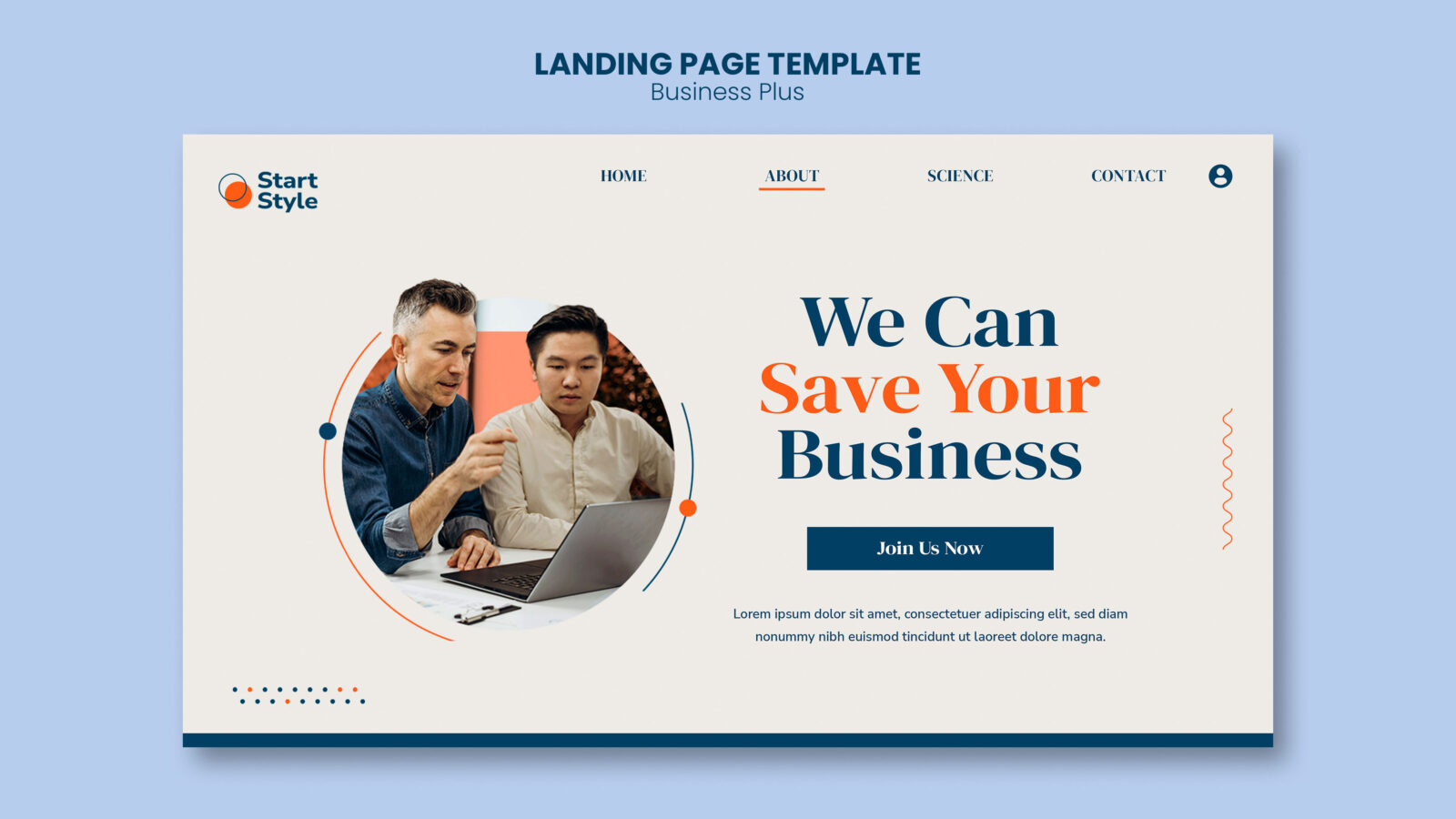
Soft Is Strong
Gone are the harsh, in-your-face gradients and heavy drop shadows pretending to be cool. Businesses are leaning into softness in a way that feels more confident than all the high-gloss maximalism we saw in recent years. Rounded corners are back—but not the bubbly, toy-like kind. Think subtle curves paired with generous white space. Gentle motion that guides instead of distracts. Sites are embracing a calm, almost tactile vibe that suggests trust, not showmanship.
Muted color palettes are leading the way, too. Not boring beige or sad gray, but warm neutrals paired with a few saturated accents that make sense for the brand. Typography is also relaxing. There’s less uppercase yelling and more thoughtful pairings—classic serifs mixed with workhorse sans fonts that read beautifully on any screen.
This shift doesn’t mean things are going minimalist across the board. It just means designers are finally listening to the fatigue users feel when everything’s loud all the time. Subtlety wins because it respects your attention. Web design agencies like Pixite tend to bring this approach to life, combining modern aesthetics with user-friendly interfaces that resonate with audiences.
The Firms Worth Following
Not all agencies have caught on to these shifts, but the ones doing standout work in this direction are often smaller, more nimble teams. They’re not chasing trends—they’re steering them, because they’re building from real conversations with clients and users instead of copying whatever’s winning awards this month.
There’s something to be said for working with studios that don’t just design around KPIs but actually shape the look and tone of the digital world. Brands hoping to connect on a deeper level are gravitating toward design partners who understand how to make a site feel intentional without losing functionality. Agencies like Focus Lab, Clay or the standout – Adchitects web design agency are setting the pace, creating sites that balance creativity with clarity.
These firms know when to hold back and when to flex. They’re the ones quietly reshaping what professional looks like online—clean, expressive, easy to use, and tailored to the brand’s actual voice rather than whatever’s trending in a mood board this week.
Goodbye Stock, Hello Character
Authenticity isn’t a trend—it’s a long-overdue correction. And in 2026, business websites will drop the overly curated stock lifestyle shots in favor of custom photography, illustrations, and even subtle hand-drawn elements. People are done being sold with the same five Shutterstock smiles. They want a brand that shows up like a person, not a template.
You’ll see more behind-the-scenes imagery, team spotlights that feel candid, and even motion graphics that are playful without being too precious. Not every brand needs quirky doodles or talking heads, but even buttoned-up industries are finding ways to show some humanity. A strong design firm will push for this kind of visual storytelling, not just nod and upload what’s “safe.”
It’s not about trying to be edgy. It’s about making sure a site doesn’t feel like it was assembled in a vacuum. That character—that sense of who you are—sticks with people far longer than a glossy landing page.
Layouts That Get Out of the Way
The best design won’t try to reinvent the wheel on every scroll. Businesses are finally letting go of overly complex layouts that only serve the designer’s ego. Instead, they’re leaning into a structure that feels intuitive and welcoming. Clear navigation, elegant hierarchy, and just enough visual rhythm to keep it engaging.
That doesn’t mean it’s boring. It means smart. A good layout now doesn’t draw attention to itself—it helps the message land without distractions. That might look like a sticky nav that gently fades until you need it again, or a single column layout that makes room for big, confident headlines and wide-open space.
This approach puts trust in the content. It assumes the visitor is there for a reason and doesn’t need to be chased by a dozen popups or hypnotized by parallax effects that lead nowhere. You still need to look polished, but you don’t need to juggle fire to get someone to click.
Back to Basics—but Smarter
There’s a quiet return to simplicity, and it’s not a step backward. Brands are asking for fewer pages and more intention. The homepage, the about page, and a few service areas—done right, that’s often more than enough. You don’t need fifteen scroll-jacking case studies if your work speaks for itself in three well-told stories.
Typography will do more of the heavy lifting. Microcopy will matter. Subtle cues like button shape or hover states will become part of the brand language. These are the things that make a website feel finished, not flashy. And the designers getting it right know how to make classic design feel like the freshest thing on the page.
Even in the tech world, where flashy features used to dominate, we’re seeing a return to elegance over noise. Accessibility, load speed, and mobile experience are back in focus, not as checkboxes but as design fundamentals.
What Matters
The best business websites in 2026 won’t try to be everything to everyone. They’ll feel like they were built by people who listened, edited carefully, and knew when to stop. If you’re working with a design firm that wants to understand your brand instead of just applying a trend to it, you’re already in good hands.
In a space where attention spans are shorter than ever, the brands that rise will be the ones who don’t shout. They’ll know how to speak clearly, show a little personality, and let the design do its job—quietly, beautifully, and with purpose.
What Really Counts
At the end of the day, it’s not about keeping up with design trends just to look current. It’s about finding the right visual language for your brand and then building a site that respects your audience’s time, expectations, and intelligence. The smartest businesses in 2026 will understand that—and they’ll know better than to DIY or settle for something pretty but hollow. They’ll find partners who get the difference.