


Looking for an inexpensive way to redecorate?
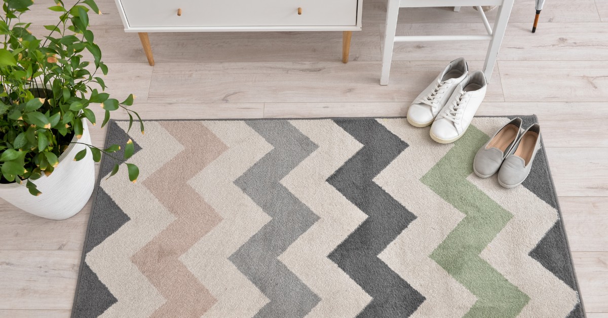
Instead of sinking thousands of dollars into home renovation projects, many folks just need to look down. Rugs and carpets might just be the most underappreciated and overlooked part of interior design. Carpets and Rugs is expected to touch the market size of USD 51.87 billion by 2025. With a consumer base this big, people clearly know the power of a rug.
So why is it that 84% of people feel their home decor still needs work? The fact is, people go into rug shopping without really considering their options. They wander around the store, pick something that looks nice and leave. Then they come home to find their brand-new rug throws the whole room off.
It doesn’t have to be that way.
Knowing how colors impact your mood and the space itself is the key to any successful home design. So what’s the catch?
Well, here’s the thing…
It’s a lot easier than you think.
If you want your home to be a soothing and relaxing place to be, then read on. You can learn everything you need to know about rug color psychology, its effects, and how to choose the right one for your space in this comprehensive guide.
What you’ll learn:
- Importance of Rug Colors
- Psychology Behind Rug Colors
- Effect of Colors in Your Living Space
- Considerations before Picking a Rug Color
- Balance in Room Design and Color
Importance of Rug Colors
A rug just a piece of floor covering? Not at all. Research has shown that 62% of people associate room colors with certain moods and emotions. In other words, when people enter a room, they can’t help but have an emotional reaction to the colors surrounding them.
What most people don’t realize is,
Their rugs are what set the whole mood of the room. A well-chosen rug will make a room feel welcoming, energized, or relaxing depending on the color. A bad rug will kill the room’s vibe, no matter how nice the furniture is.
There are some gorgeous places where the rug was just not right. It went with the furniture, the lighting was great, but something just didn’t click.
The problem was the rug color wasn’t supporting the room, it was fighting against it.
Psychology Behind Rug Colors
Ever wonder why some rooms immediately calm you down while others wake you right up?
It’s all about the Psychology of Rug Colors and how our brains react to different colors and shades. Psychologists have been studying this for decades, and the science is fascinating.
Here are some examples…
Red is the color of energy and passion. It’s great for dining rooms where you want conversation to flow, but not so much for bedrooms where you want to relax and wind down before bed.
Blue is the most calming color we know of. It’s perfect for bathrooms or bedrooms where you want to unwind. Think ocean waves, clear blue skies, and open space.
Green evokes feelings of balance and rejuvenation. It reminds us of nature and is ideal for home offices where you want to focus but not feel stressed out.
Neutrals like beige and gray are the chameleons of the rug world. They go with everything and let the other decor take center stage.
But wait, there’s more…
The shade and intensity of the color are just as important as the color itself. A light sage green will have a very different effect than a bright, kelly green. Dusty rose will feel warm and cozy while neon pink will feel much more energizing.
Effect of Colors in Your Living Space
Want to see the magic colors can do in a room?
Look no further than what happens when you pick the right rug color. Research shows that correctly choosing an area rug color can increase the perceived value of the room by 33%. That’s a return on investment.
Light colors are magic for small spaces. They instantly open up a room and make it feel more spacious and bright.
Dark colors add drama and coziness to large rooms. They also make it harder for dirt and dust to show, so they’re great for high-traffic areas.
Bold colors can make your rug the focal point of the room. They work as statement pieces that tie everything else together.
The real trick is knowing which direction to take based on your room’s needs and your lifestyle.
Size does Matter: Light vs. Dark Colors
Small spaces
Light and cool colors like whites, grays, and pale blues are best.
They open up the room and let the eye move around.
Large spaces
Warm, deeper colors like burgundies, browns, and reds are the way to go.
The rug is the place to make your color statement, so use it to draw people into the room.
Considerations before Picking a Rug Color
Got a plan for how to choose your next rug’s color? Awesome.
If not, don’t sweat it, here’s a step-by-step guide for how to make sure you don’t end up with a rug that doesn’t work in your space.
Step 1: look at your current furniture
Make sure the rug color complements instead of fights with your major pieces.
Step 2: consider the room’s function
Bedrooms, bathrooms, and dining rooms need calming or spa-like colors. Areas where you do more energy-intensive activities like cooking can handle more active colors.
Step 3: think about maintenance
Want pure white but have kids/pets? Go with cream or light gray instead and save yourself some headache later.
Step 4: Test the color in the actual space
Lighting can make a color look totally different depending on where it is in your house. Test before you commit!
The 60-30-10 Rule
This is a professional interior designer’s secret.
- 60% of the room should be neutral base colors (walls, big furniture pieces)
- 30% are your accent colors (rugs, curtains, accent chairs)
- 10% of the room are for really bold colors (pillows, artwork, accessories)
Balance in Room Design and Color
This is where most folks mess up…
They see a rug color they love and forget everything else in the room. The secret to a balanced and harmonious space is to look at the room as a whole. Your rug isn’t a stand-alone piece.
Warm vs. cool colors.
Warm colors are reds, oranges, and yellows. They feel cozy, but they also make rooms look and feel smaller.
Cool colors are blues, greens, and purples. They feel roomier but might make larger rooms feel chilly.
Contrast
We’re not talking politics here. When it comes to color, contrast is the key to interest and balance. Match everything exactly and you’ve got a snooze fest.
Instead, pick complementary colors that enhance visual harmony by up to 75%.
Layering
Your rug doesn’t have to be the only thing supporting a color scheme. Pillows, throws, and artwork all let you bring color through different items.
Common Rug Color Mistakes to Avoid
- Matching your rug exactly to your walls. (BORING!)
- Ignoring how the rug color will work with existing artwork.
- Going too bold in rooms where you want to relax.
- Picking a color that shows every little speck of dirt.
- Failing to consider your home’s natural light.
Working With Different Room Styles
Different decorating styles call for different approaches.
Minimalist/modern? Monochromatic schemes with subtle texture differences.
Traditional/formal? Rich jewel tones with classic patterns.
Boho/chic? Unexpected bold colors.
Coastal/casual? Blues, sandy neutrals.
The secret is to remain true to your style while using colors that will bring the whole room together.
Wrapping it all up
Creating harmony at home through your rug color choices isn’t hard.
The key is understanding how colors impact moods, your space’s specific needs, and then making choices that align with your lifestyle. Go bold or play it neutral, the right rug color can make any space go from meh to marvelous.
Here’s a quick recap:
- Consider room function and lighting
- Use the 60-30-10% color rule for distribution
- Think about practical needs and maintenance.
- Test colors before buying them
- Let the rug complement the other pieces, not compete with them
Take your time, trust your gut, and don’t be afraid to experiment. Your floors (and your guests) will thank you.